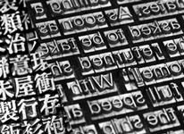
Typesetting, desktop publishing, IT. Whatever the description, it’s all about formatting text ready for printing. What sets apart multilingual typesetting is knowing how various languages behave on the page, their special features and their look.
Yes, languages have personalities of their own! For example, the Thai language has no breaks between words. Middle Eastern languages such as Arabic and Farsi read from right to left and so the page layout must be flipped. Somali translations can occupy up to 10% more space than English; Chinese translations can take up to 15% less space than English. If a Vietnamese word contains more than six letters, you know something’s wrong.
The list goes on and only years of working with languages will inform you of the things to look out for when working on multilingual setting.
That’s why you need a company that has over 23 years of experience in translating and multilingual typesetting. Language Australis typesetters have keen eyes and an innate sense of what works and what doesn’t in different languages.

Our typesetters take translations supplied in Microsoft Word or other applications and weave their magic using software such as InDesign, Adobe Illustrator, Adobe Photoshop and Quark Xpress. All you have to do is supply us with the English artwork and our setters will take it from there. It couldn’t be easier.
The typesetters work closely with the translators who guide them in such areas as word and line breaks and the general anomalies of certain languages. Typesetting proofs are then reviewed and accepted by the translators before being sent to you for approval.

Over the years, we’ve seen great diversification in typefaces in over 100 languages. Today, it’s possible to match or come very close to matching most multilingual typefaces to the English typeface you’re using for your project. Our typeface library is extensive and our setters are happy to advise on the most suitable look for your chosen language. For example, an English heading in heavy bold may not go down as well in Traditional Chinese – the strokes of the character may be too thick and start to ‘clog up’ the character. This is where our setters step in and select a lighter bold for the benefit of your target reader.
When the multilingual artwork is complete, we’re happy for you to choose which media format you or your printer would prefer – print-ready pdfs or outlines in the original application. Alternatively, you may like us to liaise directly with your graphic artist or printer on these matters. No problem. Our aim is to make this process as smooth as possible for our clients.
Language Australis can typeset anything in the written form of any size, from a one-word traffic sign to an 80,000-word prospectus. We work quickly to meet your deadline and are determined that you’ll receive a product that is pleasing to your target readers and a delight to you.

